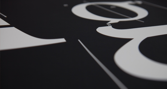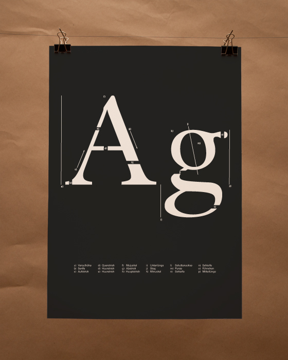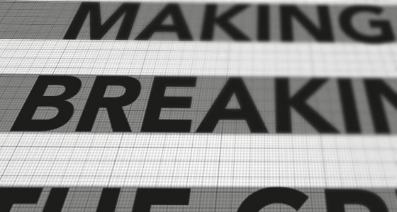


this project started in early 2010 for the typography class at the hfg. the design should be based on basic typographic facts. stuff we learned before. i decided to explain the elements of an letterform. a very clean and technical approach.


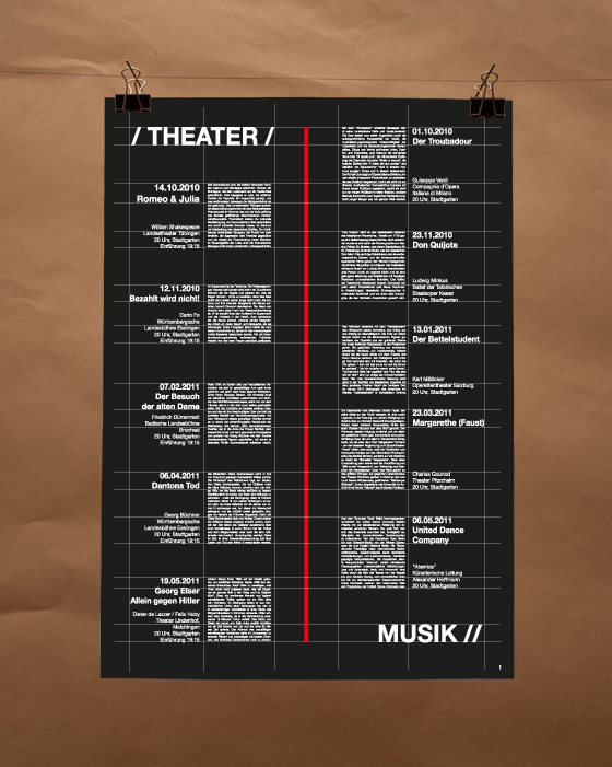
the black poster uses a red stripe to draw attention. this poster also shows all the information texts about the theater events. to make this easier to execute i deve- loped a grid to fit in all the information. the grid is still visible on the final poster.


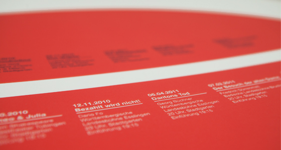
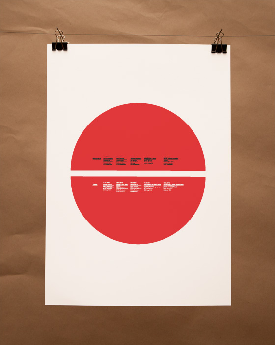
a half year later the next typography class project. we should design a calendar with event dates on them. i chose the theater in stuttgart. the red dot catches the eye, it is split in two pieces and shows the typical anatomy of a stage and the seats for the audience.


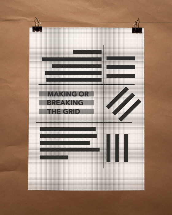
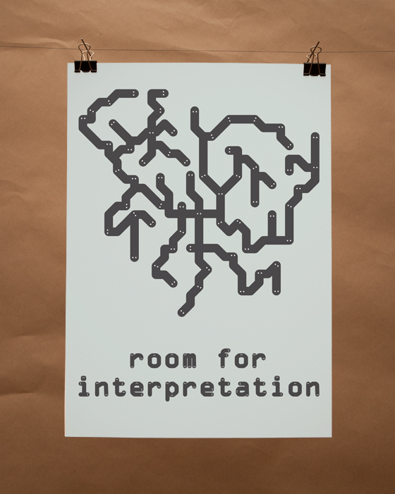
these are two posters i did with no intention. there just here because i liked them. i like to do creative work in my free time. playing with my favourite tools photoshop and illustrator.
